

Chicanos
Branding System
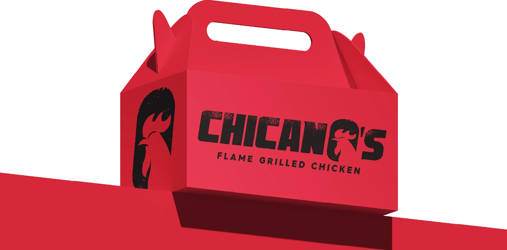
Chicanos was a concept I developed for the owner of Jmo’s (featured in another case study). The idea was to launch a Portuguese fast-food joint that captured the vibrant, urban essence of Portuguese street food.
While the owner ultimately passed on this concept, I enjoyed crafting its bold identity and the striking red tones that gave it so much personality.


Concept
I chose a bold, in-your-face font paired with a rooster icon and a grungy finish to emphasize its urban vibe, complemented by a distinct, eye-catching shade of red. This combination created a striking and memorable identity that captured the energetic and authentic essence of Portuguese street food culture.
+
+
+
+

=
=

+
+
=
Elements


Chicanos
Branding System
Chicanos was a concept I developed for the owner of Jmo’s (featured in another case study). The idea was to launch a Portuguese fast-food joint that captured the vibrant, urban essence of Portuguese street food.
While the owner ultimately passed on this concept, I enjoyed crafting its bold identity and the striking red tones that gave it so much personality.
Elements