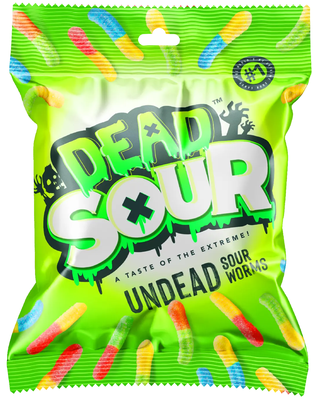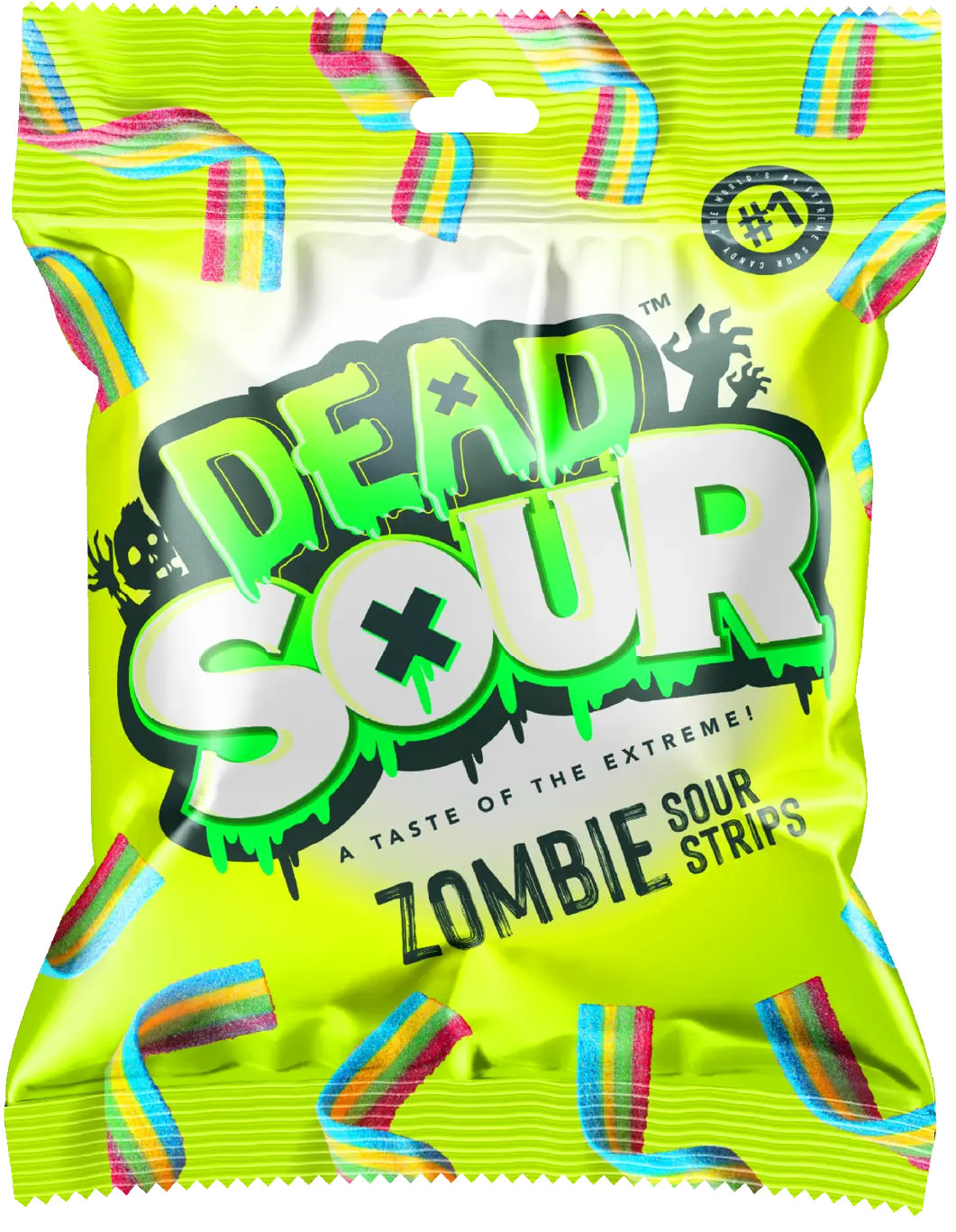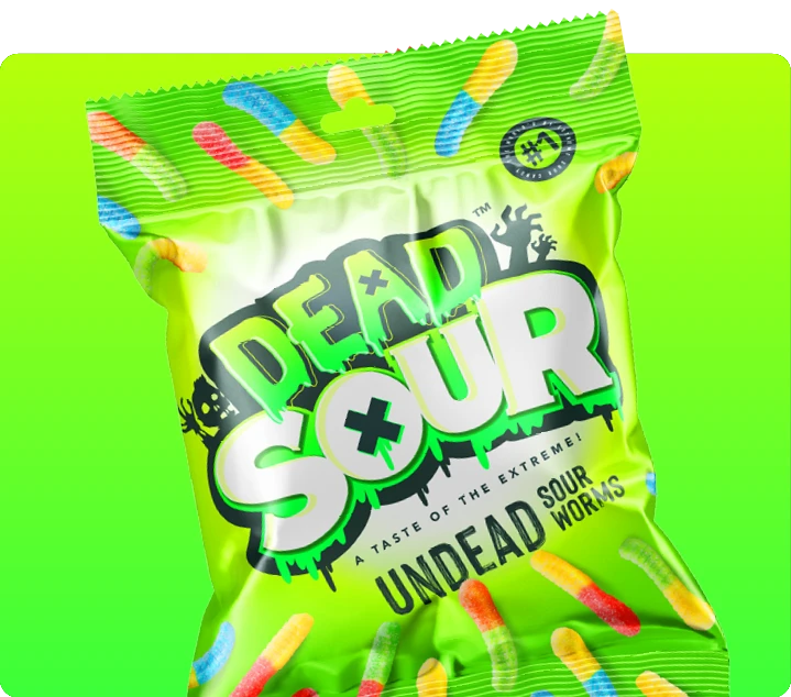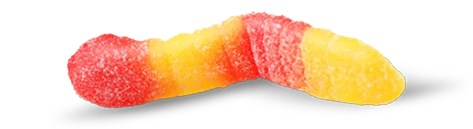


Concept
I went all in on the undead theme, using a zombie-inspired font for “Dead,” a bold serif for contrast, and a touch of gradient for extra punch. Throw in some slime, and you’ve got a bold, high-energy identity that oozes personality.
This combination ensures the brand stands out instantly while capturing its playful, edgy essence.